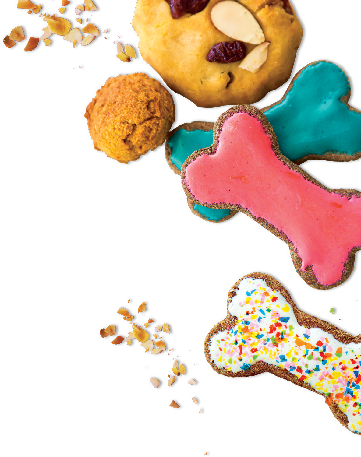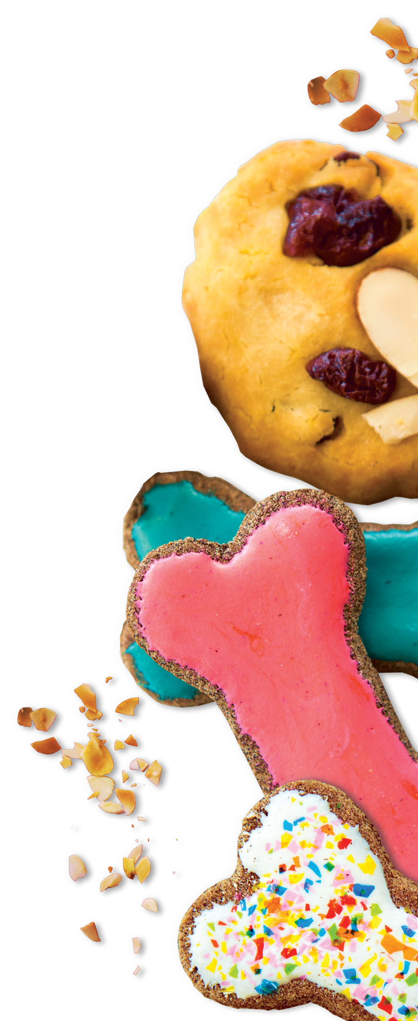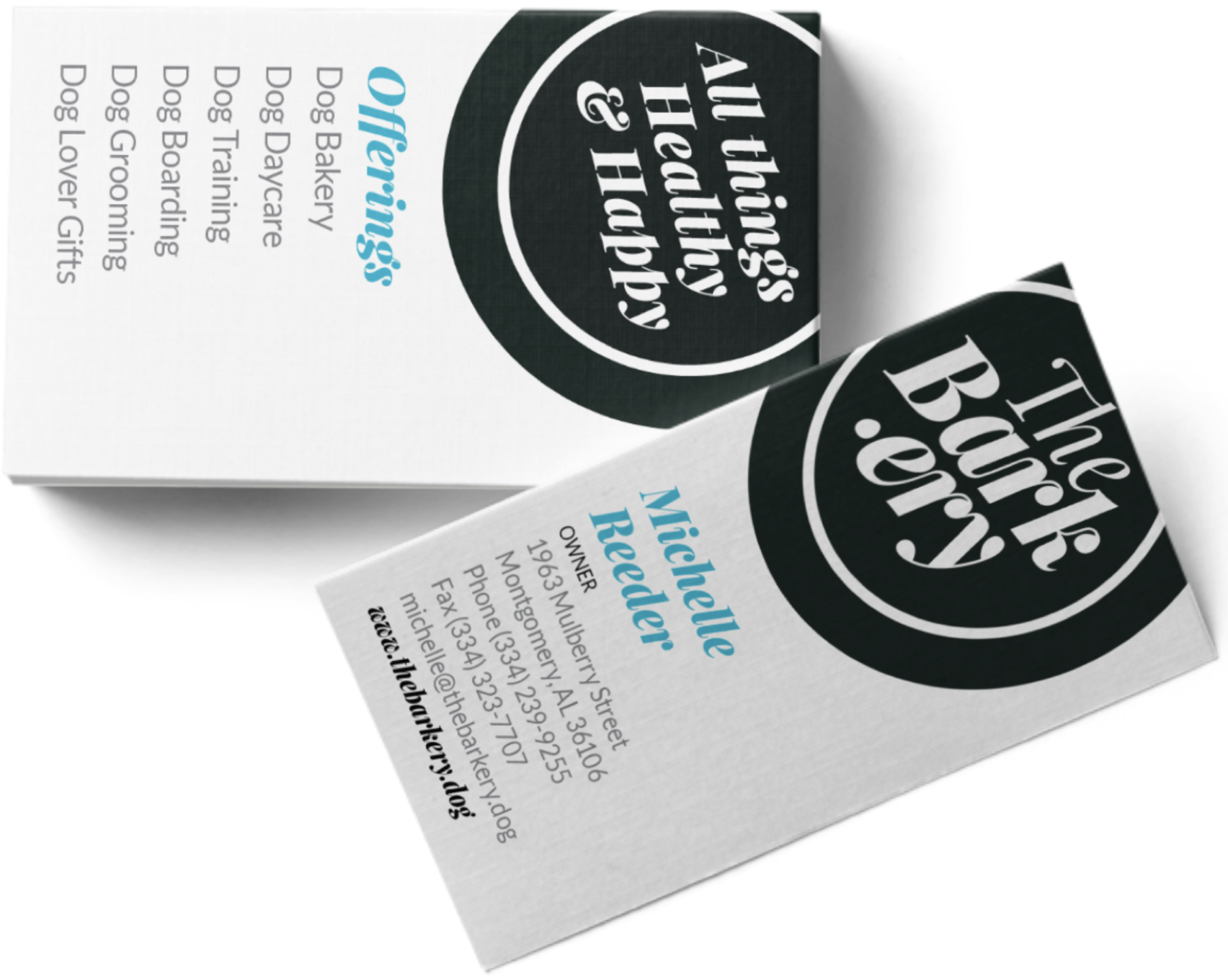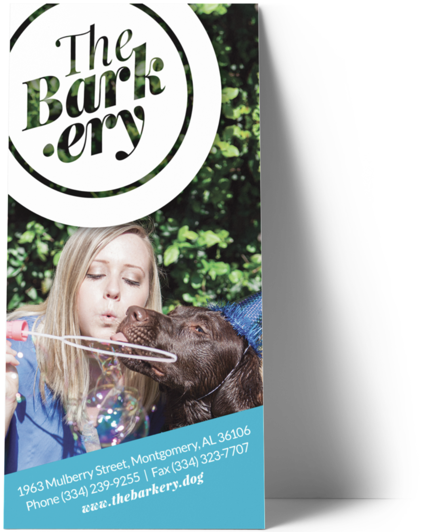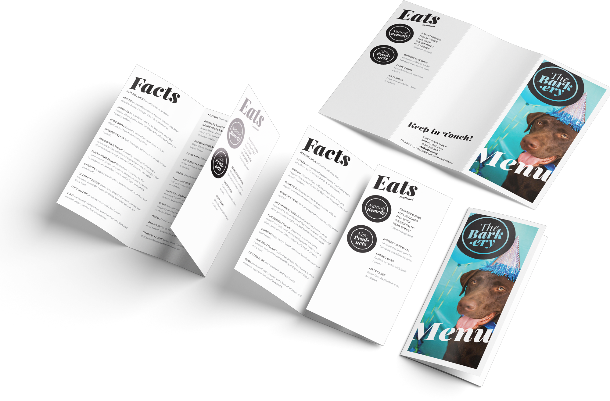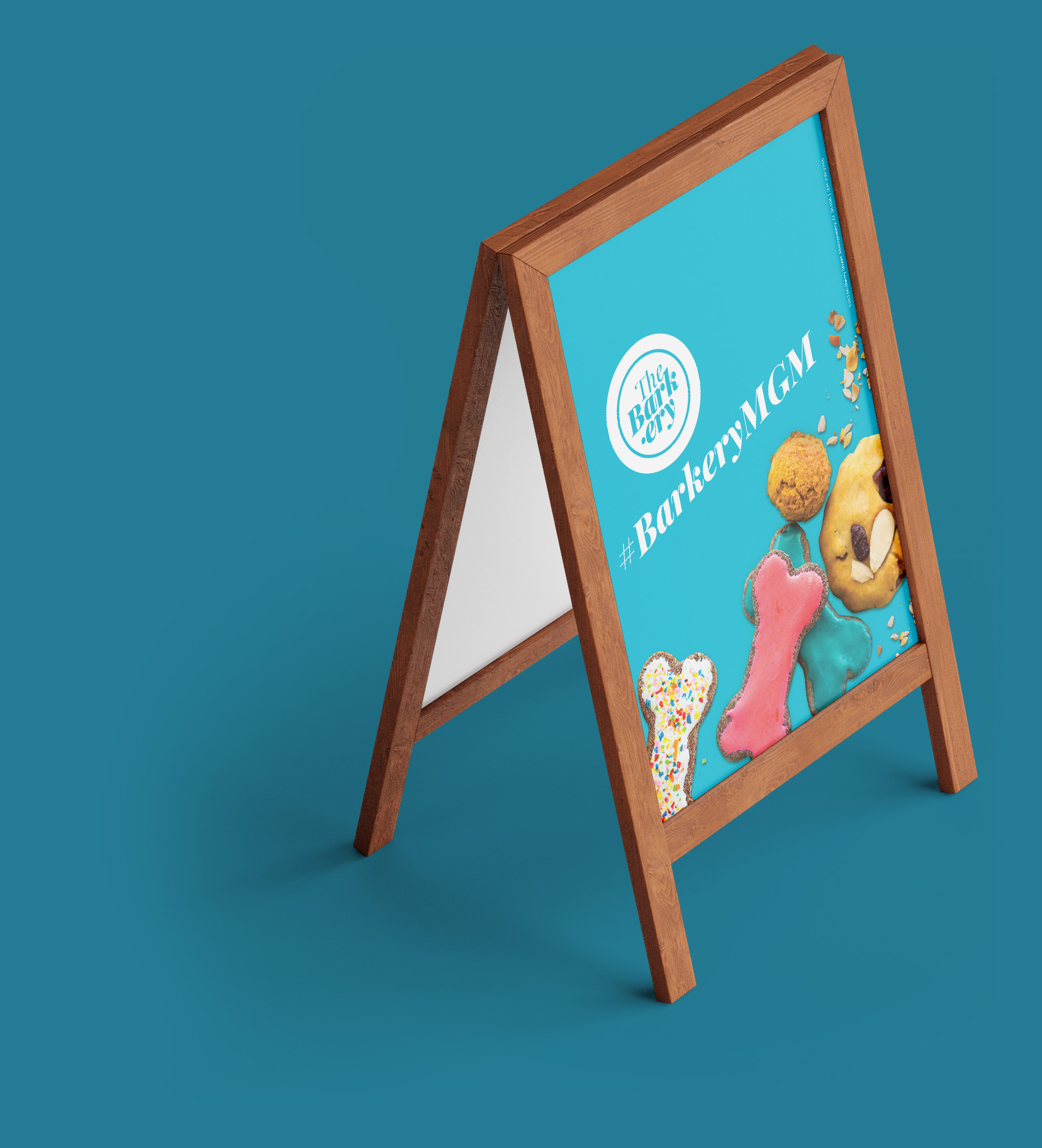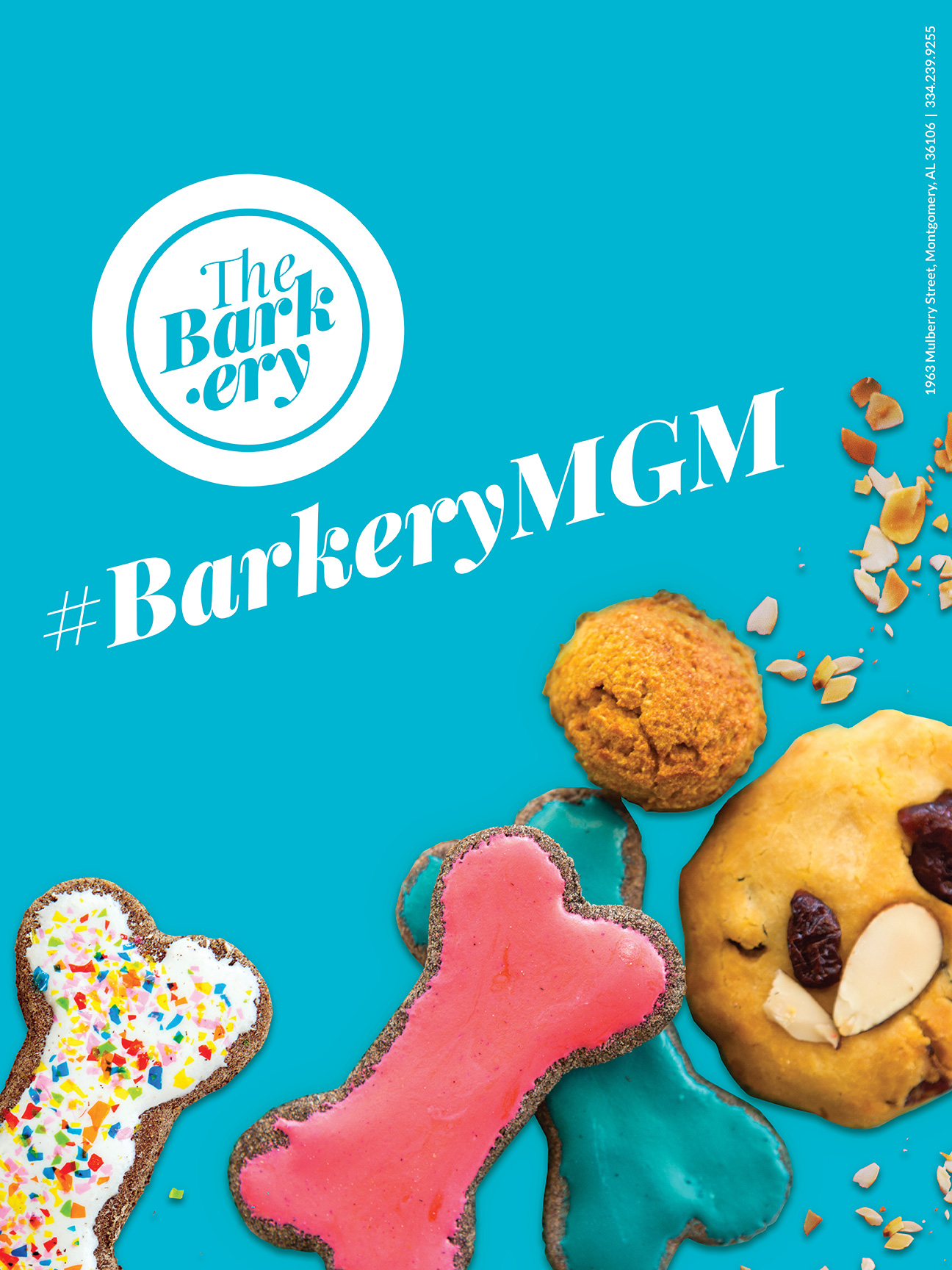
The Barkery proudly espoused hometown charm, puppy love, and artisan baking in serving its target consumers: “pet parents.” The goal was to create an authentically eclectic boutique experience that welcomed walk-ins and appointments alike, encouraged building relationships, and provided holistic care to fur babies.

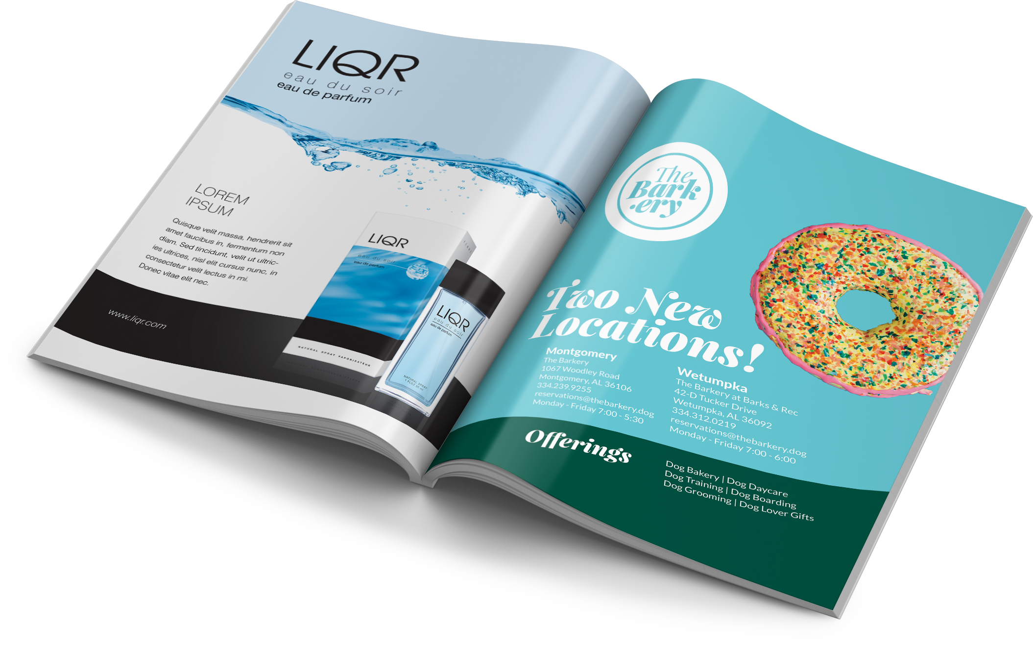
Dark green (primary color) supplants rich black except for when its naturally presence in photography. The peace of blue coupled with the energy of a yellowish undertone communicates the innate whimsy found in both the brand and its founder.
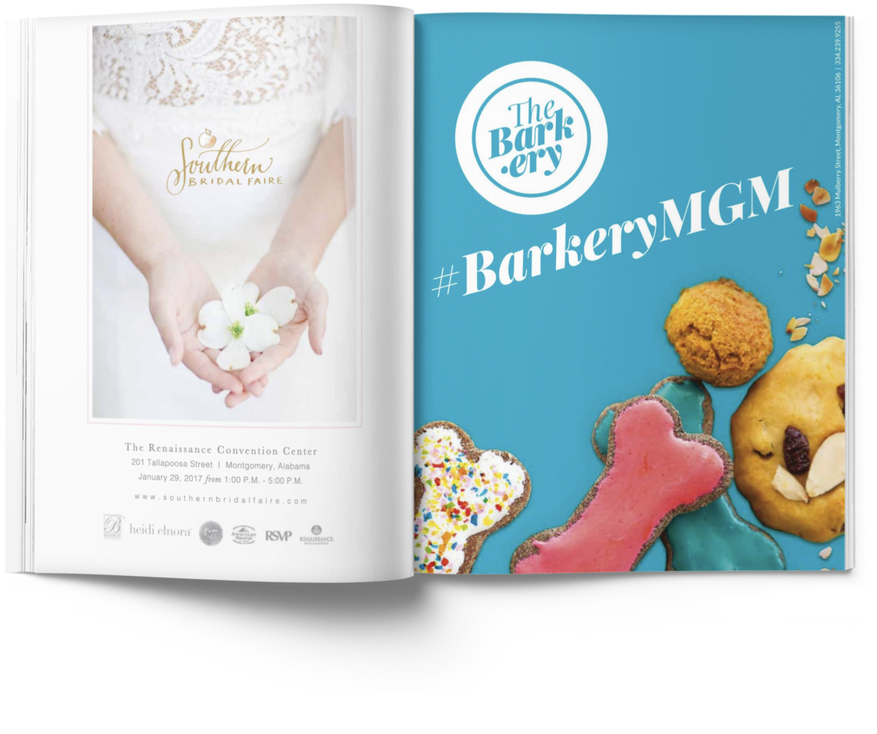
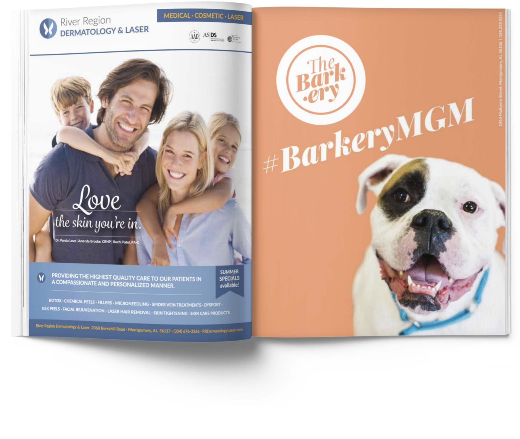
Muted jewel-tones spread throughout compositions, as exemplified in the magazine ads, aid in the brand’s playful display of its vibrant, tasty artisan treats and puppies’ love for its products and services.